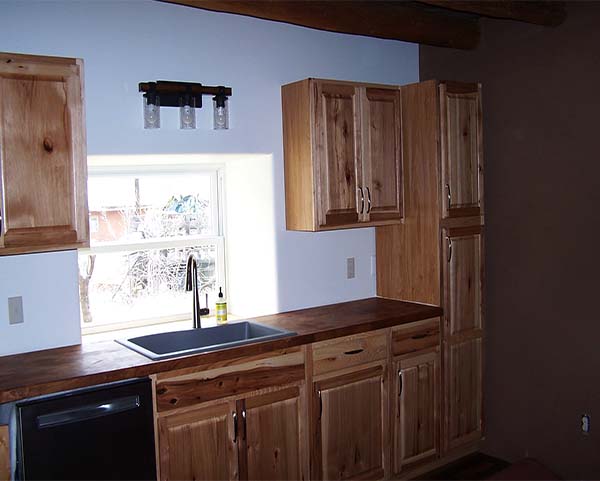
Seen here – the new kitchen cabinets, overhead rustic lights and earthen plastered walls in this old adobe home. This area of the house used to be where the bathroom was located – which moved to the opposite end.
Shown image right is the brown earthen plaster created by local soils with clay, harvested in Ojo Caliente.
We worked with the family to choose the design for the new kitchen. The cabinet design was created to fit the budget. And to provide as much storage as possible given this small kitchen has no closets or additional room for storage.
The light fixtures we suggested were a rustic “chic” look. We felt it felt mirrored and highlighted the older aspects of the home well and were used throughout.
The clients chose a butcher block countertop which was stained it provide contrast to the cabinets, using a walnut color. Norbert cut and installed the countertop from a larger slab, and added on an extra piece to extend and cover additional cabinets. We are happy with the results.
Renovation for this room involved adding electricity and light switches and sheet rocking the wall with the window in it. It was decided to paint the wall a slight tinted off-white to keep the room as bright as possible. The contrast between the white wall with cabinet features against the other walls plastered with earthen plasters, created a crisp yet warm feel.
As with the other ceilings in the house, the overhead planks and vigas were sanded and cleaned. The finished look coupled by the new aged looking new floor, creates a look that we all were happy with when all was said and done.


