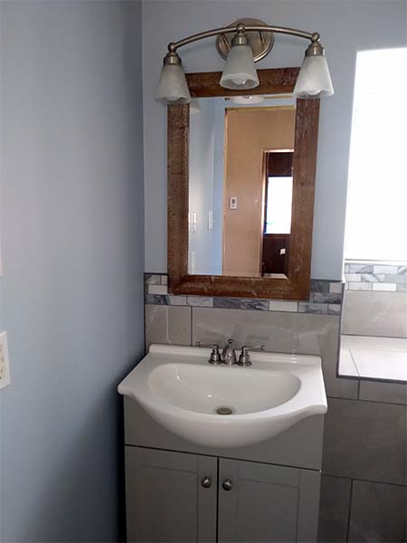
The new grey bathroom vanity is the first thing you see when you enter the bathroom.
The grey vanity and sink collection were a good cost efficient addition to the room. A simple design which came as is – no modifications or painting needed. We simply placed it and did a quick plumbing installation. The sink design and the vanity has a nice custom feel. The vanity/sink was off-the-shelf, but we thought given the design looked higher end.
We helped choose a faux rustic mirror to complement the overall look. The frame has a slightly rough texture with a small amount of “white wash” finish.
The light fixtures were those we also helped choose. The direction was to use brushed nickel, a popular finish. It also gave many options to choose from. A classic three bulb fixture with clean lines did the trick. Choosing a clean lamp design that would not look dated over time, we felt this one worked.
The backsplash and window wall feature was designed to relate to the shower. The overall idea was to choose large grey marble (looking) tiles for the field. A wainscot effect would led into the shower stall. A bit of interest was added by way of mosaic tiles. The mosaics chosen picked up the light and mid grey tones of the larger tiles as well as the floor tiles. A simple stripe was carried through behind the backsplash, through the window sill and over to the shower pan.
Added features which complicated installation a bit were the handrail for the toilet, and two installed in the shower for the elderly occupants.
Finally, a slight blue tinted paint was chosen for the walls to add a bit of variety. The crisp feel to the bathroom, with a new polished look created a much improved space.


