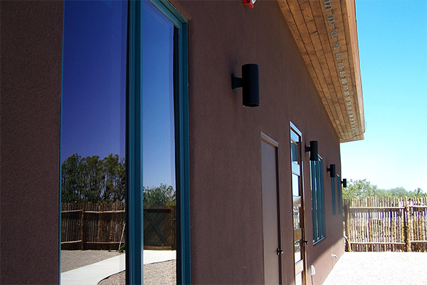
In this additional view, front of house on our most recent build – more details can be seen. This close up shows again the dark brown finished plaster. The plaster coat chose is the acrylic based Stowe which think are more durable than cement stucco over time.
The walnut stained soffits dare seen here and blend well with the teal metal clad windows. The five panel glass window front door can only be seen marginally, three doors/windows in. We especially liked the tube minimalist exterior lighting, which matched the clean lines used throughout.
The image here shows the long expanse of the house with it’s simple design and shed roof. The interior is as seen in our gallery images, mostly an open floor plan. Only two rooms lead off from the main living and kitchen space. The garage is tucked into the house and might be converted at a later date to a bedroom, or additional studio space.
Simplicity of design allowed us to keep the budget in check and allow for adding extra flair in other areas. Such as the elaborate mosaic shower stall design and execution. Or the dark blue stained pigmented cement floors. And colorful paint choices to contrast with decorative interior furniture pieces.
One of our prior project inspired this design. That of having high ceilings, a loft feel and and open floor plan. The client saw photos from the studio we created the year prior and wanted a similar simplicity and tall ceilings. We do agree that giving some aspects of any home some ceiling height can make a space feel larger. Not a new idea, but something to consider when designing a home. Keeping interior walls and complexity to a minimum, adding some height to a room. Both can change the feel of any new space quite dramatically.


